
Build a SQL Dashboard with AI: A Worked Example
Build a SQL dashboard with consistent KPI cards, charts and filters. Follow a tested PostgreSQL example, an AI builder workflow and practical sharing checks.

A SQL dashboard turns database queries into a repeatable set of KPI cards, charts and tables. To build one with AI, connect an approved reporting datasource, define the metrics and filters, describe the page you need, and verify every widget against the same reference data before sharing it.
This walkthrough builds a small sales dashboard with three outputs: a net-order-value card, a daily chart and a regional table. It includes downloadable PostgreSQL reference SQL and execution notes. The synthetic SQL was executed locally in PGlite, a PostgreSQL WASM runtime. We did not benchmark an AI-generated dashboard or connect to a production database. AskYourDatabase publishes this guide with AI-assisted drafting and local reference checks.
For product menu instructions, use the Dashboard Builder documentation. This guide focuses on designing a reusable SQL report whose totals, filters and refresh behavior agree. For one-off questions, start with natural language database querying.
Choose the dashboard's job before choosing its charts
A dashboard should answer a recurring decision. “How are sales doing?” is too broad to implement reliably. “Show paid USD orders for one business unit, net of recorded refunds, with a daily trend and regional breakdown” is specific enough to test.
| Need | Suitable starting point | What to verify |
|---|---|---|
| Explore an unfamiliar number | Conversational database analysis | The question, SQL and result agree |
| Revisit approved metrics and filters | SQL dashboard | Every widget uses the same definitions |
| Deliver a fixed report by email every Monday | A verified reporting and delivery workflow | Scheduling, recipients and attachment support |
| Give customers access inside your app | Authenticated embedded dashboard | Viewer identity and database authorization |
Do not assume that a dashboard builder includes scheduled email, PDF delivery or every export format. Those are separate requirements to verify for the product and plan. The AI business intelligence page describes the conversational route, while the embedded analytics guide covers customer-facing chat architecture.
Write a metric contract that every widget shares
For this example, approve these definitions before generating the page:
| Rule | Example definition |
|---|---|
| Source grain | One row per order after refunds are aggregated |
| Audience scope | Tenant A only; USD only |
| Period | September 1 inclusive to September 5 exclusive, 2026 |
| Included orders | Status is paid; cancelled orders are excluded |
| Net order value | Order gross minus refunds recorded before the fixed September 5 snapshot cutoff |
| Daily grouping | Original order date, even when the refund occurred later |
| Average order value | Total net order value divided by included order count |
| Empty results | Zero total and count; average shown as unavailable |
Keep the refund snapshot cutoff fixed when narrowing the displayed order dates. Otherwise changing a date filter would also change which refunds are known, and the widgets could answer a different question.
This is an order-cohort report, not cash received during the period. A September refund of an August order is outside this September order cohort. A refund recorded in October is not included in the September snapshot. Cash-flow reporting needs a different definition and query.
The fixture uses date-only fields that already represent the agreed business date. If your source uses timestamps, decide the reporting time zone and convert consistently before applying the date window. Our PostgreSQL setup guide includes a separate timezone/calendar example. Never combine USD and EUR amounts without an approved conversion method.
Prepare an order-grain dataset before drawing charts
The reference has eight orders, two September refunds for order 101, one refund for order 103, and a later October refund. It also includes a cancelled order, a different currency, a different tenant and an order beyond the cutoff. These deliberate distractors make incorrect filters visible.
Run the complete reference SQL in a fresh PostgreSQL test session. It creates temporary objects that last only for that session. It is a developer reference, not an import file for AskYourDatabase. For an actual builder connection, have the database owner provide an approved persistent reporting view in a test database; do not expect temporary objects from a separate session to appear.
The central transformation aggregates refunds before joining them to orders:
WITH refunds_per_order AS (
  SELECT r.order_id, SUM(r.amount_cents) AS refund_cents
  FROM dashboard_refunds r CROSS JOIN dashboard_params p
  WHERE r.refunded_on < p.refund_before
  GROUP BY r.order_id
)
SELECT o.id, o.ordered_on, o.region,
       o.gross_cents - COALESCE(r.refund_cents, 0) AS net_cents
FROM dashboard_orders o
CROSS JOIN dashboard_params p
LEFT JOIN refunds_per_order r ON r.order_id = o.id
WHERE o.tenant_id = p.tenant_id AND o.currency = p.currency
  AND o.status = 'paid'
  AND o.ordered_on >= p.start_date AND o.ordered_on < p.end_date;
Order 101 has two eligible refunds. Joining those refund rows directly to orders repeats its gross amount. On this fixture, that incorrect join produces 39,900 cents instead of 27,900. A chart can render either number equally convincingly. PostgreSQL's join documentation explains how matching rows combine; inspect the row grain before summing.
In a real system, use the complete business key for joins. This synthetic fixture makes order IDs globally unique. If IDs repeat across companies or tenants, include that scope in the refund key and join as well. A tenant predicate in sample SQL describes calculation scope; it is not an authorization mechanism.
Reconcile the KPI card, chart and table
The downloadable file defines the filtered dataset as dashboard_base, then runs three queries. The card query is:
SELECT COALESCE(SUM(net_cents), 0) AS net_cents,
       COUNT(*) AS orders,
       ROUND(SUM(net_cents)::numeric / NULLIF(COUNT(*), 0), 2)
         AS average_order_cents
FROM dashboard_base;
Expected values are 27,900 net cents, 4 orders and 6,975 average cents. Display those monetary values as $279.00 and $69.75 after conversion from cents. Keep currency and units visible in labels. PostgreSQL aggregate behavior matters for empty inputs: the total needs an explicit zero fallback, while an average with no orders should remain unavailable.
| Date | Net order value | Orders |
|---|---|---|
| September 1 | $105.00 | 1 |
| September 2 | $134.00 | 2 |
| September 3 | $40.00 | 1 |
| September 4 | $0.00 | 0 |
The daily query creates a calendar and left-joins the filtered orders so September 4 remains visible. A missing point is not automatically a zero; here zero is justified because the test data is complete and no qualifying orders exist on that day.
The regional table returns North $225.00 across 3 orders and South $54.00 across 1 order. Their totals sum to the card. Their average order values are $75 and $54, but the overall average is $69.75, not the unweighted average of those two figures, $64.50. Recompute ratios from their numerators and denominators whenever the grouping changes.
Build this page in AskYourDatabase
1. Connect a test datasource and add business context
Open Datasource, create a datasource and configure the supported connection. Use a reporting account limited to approved data. Add the metric contract, relevant table relationships and reporting-view descriptions in the datasource's documentation field. Do not put passwords or production row values in explanatory prompts. See the connection guide for database-specific prerequisites.
2. Create a dashboard page with an explicit prompt
Open Dashboard, create a dashboard, then create a new page. Select the intended datasource and provide a page name and description. Start with one reporting scope and a small number of components:
Create a read-only sales dashboard from the approved order reporting data. Show net order value, paid order count and average order value. Add a daily net-value chart and a regional table. Use tenant A and USD in the test dataset, September 1 inclusive to September 5 exclusive. Refunds before the September 5 snapshot cutoff reduce the original order date. Keep that refund cutoff fixed when filtering the displayed order dates. Use one shared date scope for every component. Show every calendar day, including zero-order days. Show unavailable for averages with no orders. Include loading, empty and query-error states. Do not add write forms or actions.
This is a requested specification, not a promise that the first generated version will implement every detail correctly. Check the result and refine it.
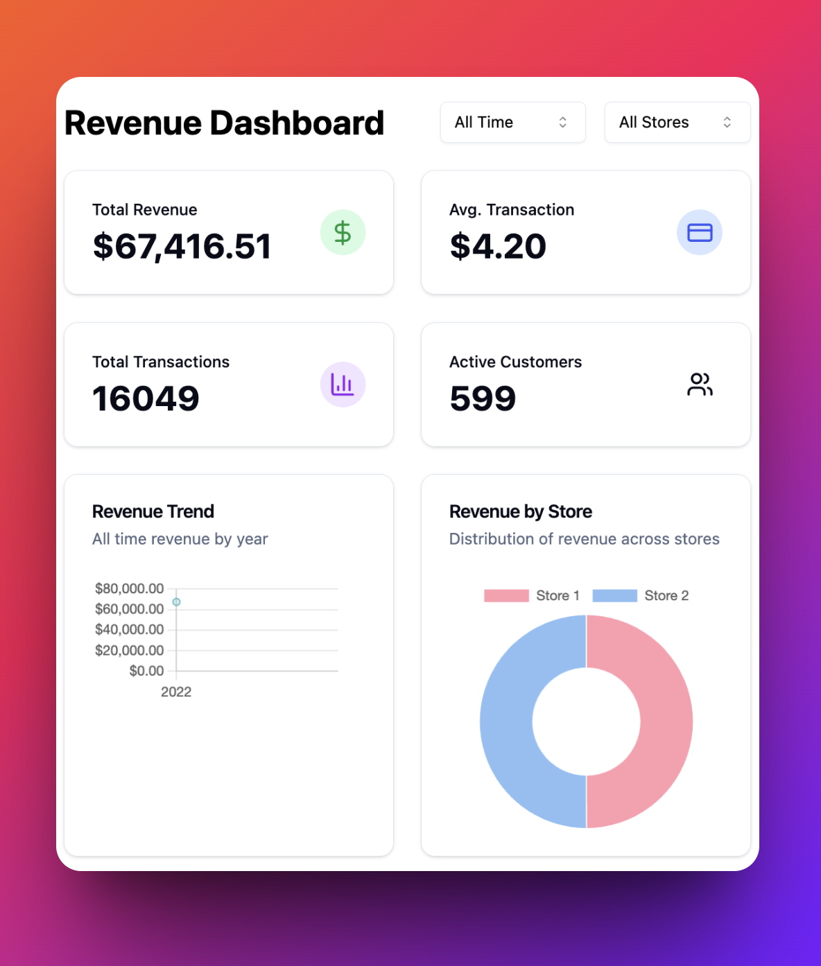
The image shows the existing AskYourDatabase product interface. It is not a screenshot of the synthetic reference results above.
3. Validate the generated page before refining its appearance
Compare the card, chart and regional table with the expected values. Review the generated query paths and component behavior with the database owner. Change the description to correct one issue at a time, then rerun the complete checklist. The editor exposes modification history; do not assume that a saved prompt proves a previous result is still correct.
For more general assistant acceptance tests, use the text-to-SQL evaluation kit. Here the additional requirement is agreement across a persistent page: a correct card alongside an incorrectly filtered chart still fails.
4. Test filter, empty and error states
| Change | Expected acceptance result |
|---|---|
| Restrict to September 2 | Card $134, 2 orders; daily and regional totals also $134 |
| Select North | Card $225, 3 orders; South disappears from the table |
| Select September 4 only | Total $0, count 0, average unavailable |
| Add a $10 September refund to order 102 in the test data | Total becomes $269 after a successful reload |
| Make the datasource unavailable in a controlled test | Show an error or clearly marked stale data, not a successful $0 |
The numerical changes were checked against the local reference. Filter controls, network failures, permissions and refresh behavior still need testing on your generated page. Only run data mutations in an authorized disposable test database.
Define freshness and access before sharing
A live database connection does not tell viewers when a number was last computed. Ingestion delay, reporting replicas, caching and widget execution all affect freshness. Specify when queries should run and verify that behavior on the generated page. Show the last successful data-load time, not merely the current browser clock. If queries for different widgets run at different times, disclose that or use a consistent reporting snapshot when the database supports it.
Control query cost separately: review execution plans, useful indexes, result limits, timeouts and refresh frequency with the database owner. Three widgets repeatedly scanning the same large source can create a different workload from a single ad-hoc question. This guide does not claim automatic query tuning or a fixed refresh interval.
For embedding, follow the dashboard widget documentation. The documented flow creates a widget session from your backend and loads its URL in an iframe. Authenticate viewers before issuing sessions, keep the API key server-side and test the actual database execution identity. The temporary callback code and the resulting session have different lifetimes; do not treat a short-lived callback link as the full authorization policy.
The builder can also generate data-changing components. A read-only reporting prompt is useful design context, but database permissions must enforce your reporting-only policy. Verify unauthorized rows and write attempts separately. Local application hosting also does not guarantee local AI processing: review security and data flow and private deployment for your configuration.
To evaluate this workflow, start with the Dashboard Builder instructions, a small test datasource and the reference totals. Review plans and contact the team to confirm dashboard availability, sharing and deployment requirements before selecting a plan.
Frequently asked questions
What is a SQL dashboard?
A SQL dashboard displays metrics, charts and tables backed by database queries. Its value is a repeatable view with consistent definitions and filters, rather than a one-time answer or a static chart image.
Can AI build a dashboard from my database?
AskYourDatabase Dashboard Builder can generate dashboard pages from a connected datasource and a natural-language description. Review the generated queries and components against known results before sharing; generation does not prove that the metrics are correct.
Why do my SQL dashboard totals disagree?
Common causes include joining multiple child rows to each order, applying different filters to different widgets, mixing currencies, and averaging subgroup averages. Reconcile all widgets against the same approved row grain and reporting scope.
Does a live connection guarantee real-time updates?
No. Visible freshness depends on ingestion, replicas, caches and when each widget executes its query. Verify the generated page refresh behavior and label the time of the last successful data load. A live connection alone does not establish a refresh interval.
Can I embed the dashboard in my website?
AskYourDatabase documents a backend-created widget session and iframe flow. Keep the API key server-side, authenticate the viewer and verify the permitted data on the actual execution path. Session access alone does not prove tenant-level row isolation.
Does the downloadable SQL measure AI accuracy?
No. It is a synthetic PostgreSQL reference for checking dashboard calculations. It was executed locally using PGlite; no AI-generated dashboard, production database or vendor accuracy score was tested.